Starter Kit Redesign
Increased the Starter Kit's marketing and educational value by enhancing the unboxing experience, graphics, and learning materials.

Overview
Note: Some content has been redacted or omitted to comply with my NDA.
A popular product, the Operation 36 Golf (Op 36) Starter Kit is supposed to provide junior students with most of the tools and info that they need to start the program. However, we realized that:
- The margin of the product was low.
- The packaging could look more exciting, and it didn't hold the items in place very well either.
- The educational brochure included didn't cover all aspects of the program.
-
It didn't include a golf ball, which is an important piece of
equipment that we could fit in the box.
- Other equipment like golf clubs and clothes wouldn't fit in the box, of course, and it would need to be specific to the student.
so we decided to give it a drastic makeover.
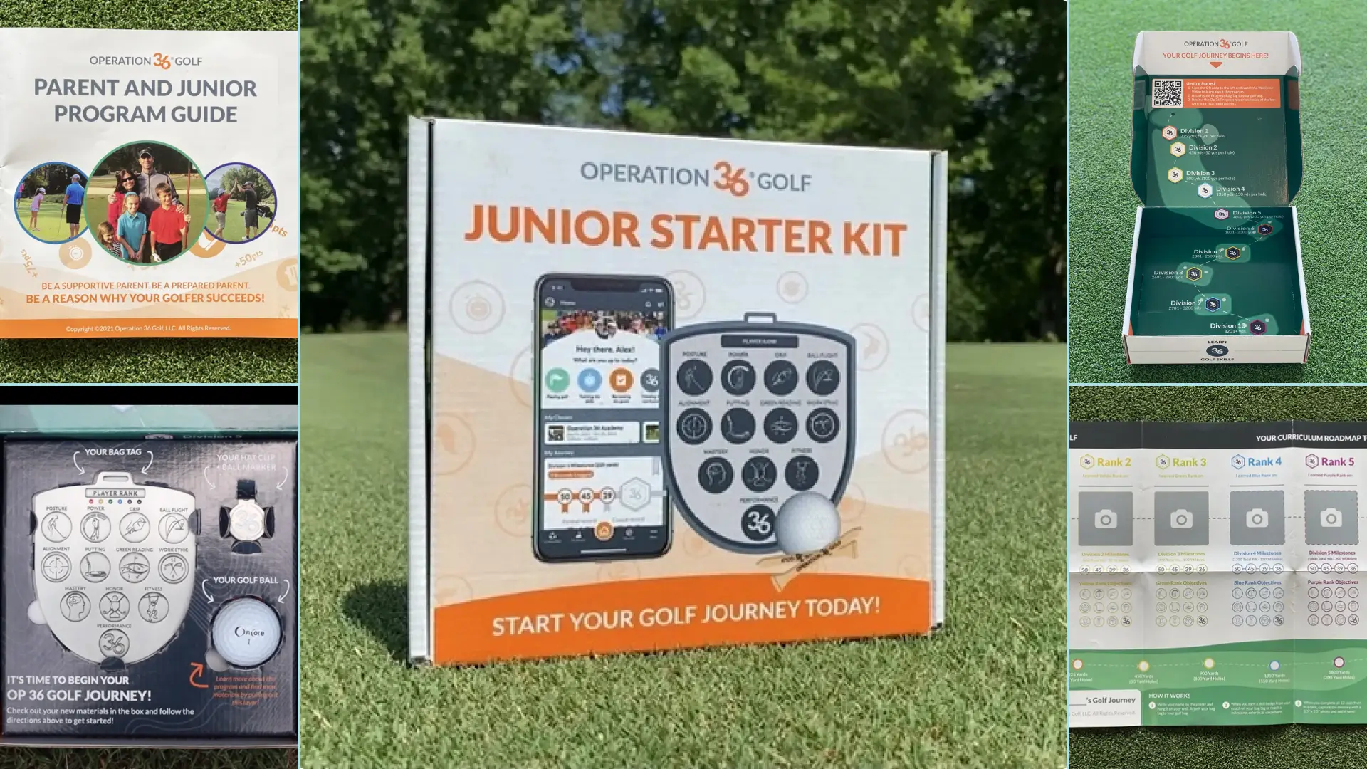
I shrank the box's size, then updated the box art, inserts, and print materials to fit the new size. I also added a golf ball to the insert. Then, I added more copy to guide the student and parent into the program. The back and interior of the box provided instructions for creating an Op 36 app account. As for the brochure, I converted that into a 24-page booklet that covered the program in-depth and in a logical order. This provided coaches with an all-in-one tool to excite their students, then review each part of the program with their students and parents.
These updates actually increased the price of the Starter Kit. However, they also improved the marketing, educational, and functional value, so it was worth it in the end.
Don't have time to read the process? Jump to Results for more final designs!
Process
Objectives

- Reduce the cost of this product.
- Improve the opening experience for the student and family so they feel more excited and for the coach so it’s easier to market to new students.
- Improve the educational content provided outside and inside of the box so families fully understand the program.
Research: Paper prototype exploration and issues with current box

To reduce the cost, we started by comparing the options offered by different printing companies.
For the design, I made some paper prototypes to try different insert structures and box sizes. That helped us find a compromise between box cost and ergonomics.
We also noted issues that our box distributor, families, and coaches have with the current design. Items were not secured very well, the print materials didn’t explain the program or app well enough, and the product didn’t feel “high quality.”
Ideation: New box artwork and print material designs

After finding structures to try, I started designing the artwork for the box and insert. I had to find a balance between exciting and informative. The front cover required the most iterations because we would be using it in marketing materials.
I also redesigned the progress poster and turned the educational brochure into a small, more detailed booklet, both constrained by the limitations of the printing company.
Prototyping: Gathering feedback on artwork, booklet, and box structure

I didn’t have the box’s contents and couldn’t manufacture the box myself, but I did gather user feedback on the artwork and the booklet.
Once the box company shipped a sample to us, we were able to unpack and pack the box as if we were a student viewing it for the first time. We shared our pain points with them using diagrams and asked them to make revisions.
Results: More expensive, but improved opening experience and value

Because of the new artwork (box interior, box exterior, insert), addition of a golf ball, and the brochure that was turned into a booklet, the kit actually became more expensive.
However, we improved its opening experience, effectiveness as a marketing tool, and perceived value, which led to more sales, so the upgrade was worth it in the end.
It even got our own team aligned on the messaging communicated to our users!


Reflection: Consider assembly effort and more box testing
This project was fairly successful. If we had more time to research and test, here are some ways I would have improved my process.
- Ask our box distributor to test the new box and insert. We ended up having to redesign the insert so it was easier to assemble and held the items more snugly.
- Ask more of our students, families, and coaches for feedback on the new box and its print materials. Maybe there are areas that don’t make sense to them or are missing information about the program.
- Explore more printing companies to potentially discover more cost-effective options.