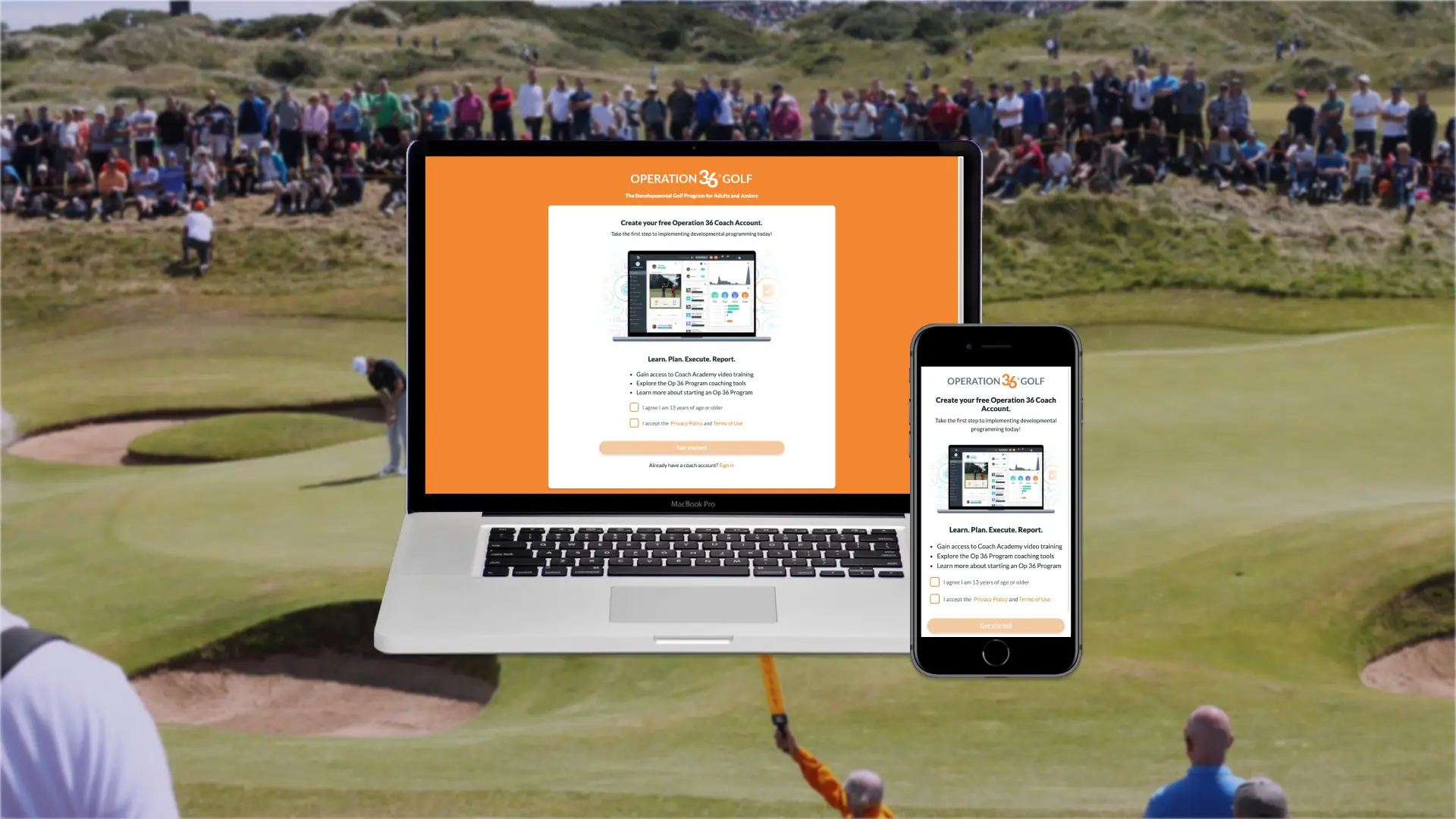
Free Coach Account Registration
Generated hundreds of leads for our sales team by allowing coaches to create free accounts in our web app.

Overview
Note: Some content has been redacted or omitted to comply with my NDA.
The Operation 36 Golf (Op 36) website provides a brief overview of the app's features. However, if a prospective coach wanted to learn more, they had to sign up for a demo. There was no way for them to explore the app without some sort of commitment. We suspected that this barrier reduced signups. Due to technical constraints, we couldn't provide a "trial" version of the Op 36 app where some features were free yet limited. Instead, we opted for a way to create a "free" coach account where they could watch videos about each feature and educate themselves.
To do this, we created the Free Coach Account registration form in the web app. As a prospective coach went through the form, they provided our team with enough info to personalize a demo for them. Our sales team could fill out a program planner for them and show them how the Op 36 program would be a fit for their particular facility. Once the prospective coach finished registration, they not only had videos about each feature, but they also had access to video courses in our Coach Academy - step-by-step videos on how to run a successful program. All of these free services would hopefully motivate them to book a demo and sign up.
Don't have time to read the process? Jump to Results for more final designs!
Process
Objectives

- Help our sales team gather more leads and demos.
- Allow leads to create a “free coach account” so they can learn more about our product in their own free time, increase the chance of booking a demo, and increase the chance of a sale.
Research: Sales team's needs and market research on onboarding

This feature was meant to help the sales team, so I started out by asking them what they want to know about the lead. These details would form each step of the task flow. There were a lot of questions, so we decided to split the flow into a “registration” phase and an “onboarding” phase.
I also studied the different types of transitions between questions in form builders and fitness apps’ onboarding flows. One common technique for making long registration flows less intimidating was putting each question on its own page, so I kept that in mind.
Ideation: Simple designs and different numbers of questions

Then, I started exploring designs in Figma for the registration, onboarding, and dashboard experience for the coach and the sales lead manager for our team.
I kept the designs simple for the coach so they could be responsive and so the experience feels less overwhelming. I also experimented with the number of questions visible at one time so we could do A/B testing with our team.
Prototyping: 1-2 questions per page is best

I couldn’t test these designs on prospective leads, so I asked our team and stakeholders.
The biggest takeaway was that limiting the view to 1-2 questions at a time provided the best experience. We could group closely related questions into the same view to avoid having too many steps.
Other than that, they were happy with the simple designs and suggested a few extra questions, like “Why are you creating this account?”
Development: Designing reusable form components and patterns

I built the frontend for the coach experience, while my teammate built the frontend for our internal lead manager and backend for the entire system.
Most of my time was spent making the questions a reusable React component so it would be easier for us to add questions in the future. That component had to handle different types of validation and edge cases.
We demoed to our team every week and let them try clicking through it themselves, but most of the changes that they requested were minor.
Results: Hundreds of leads, but not enough conversions

We tracked the number of leads, demos, and sales that this system generated over a few quarters.
While we received hundreds of leads, and some of those booked demos (either on their own or from our sales team reaching out), none of them converted to sales.
Thus, we determined that our current method of gathering leads - asking them to book a demo when on our website - was more effective. We stopped working on this new coach registration system.


Reflection: Listen to sales calls and get feedback from existing customers
While it was worth a try, and it improved some metrics, this feature failed to move us towards our sales objectives, even though we sunk months into planning and building this feature and spent several more months tracking metrics.
Looking back, there were several ways that we could have done more user research. That could have improved our idea and increased the chance of success, or it could have shown us that our idea wasn’t viable early on before investing development time.
- Listen in on sales calls (cold calls, demos, closings) to understand how our sales team causes leads to close
- Ask coaches to describe to us the last time they were sold on a product. This would help us discover other techniques.
- Test our assumptions and prototypes on some of our existing customers (closest we can get to leads), not just our team.
- After releasing, measure churn at certain parts of the flow (registration, onboarding, dashboard) to find problem areas.