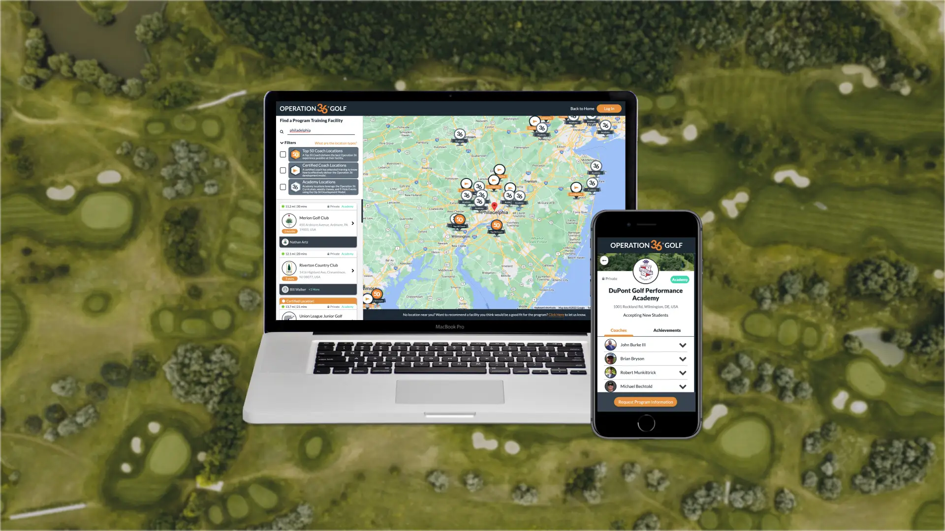
Community Map and Leads Manager
Generated hundreds of student leads for our coaches by allowing students to browse golf facilities and contact coaches.

Overview
Note: Some content has been redacted or omitted to comply with my NDA.
With Operation 36 Golf (Op 36), coaches had a structured golf program to deliver to existing golfers. However, they needed to grow their programs by bringing in new golfers, but they couldn't just rely on just word of mouth. We also wanted a way for users that found our website to find an Op 36 program near them. That's why the Community Map and Lead Manager were born in the web app.
The Community Map is a tool for prospective students to find an Op 36 program near them and easily connect with a coach. After they locate a program that they're interested in, they fill out a short form that describes what they are looking for, which is then sent to the coach's Lead Manager as a lead. From there, the coach can keep track of leads, add notes whenever they contact a lead, and easily send invitations to the program (and app) once the lead is ready to join.
With recent updates, the Community Map now links to the New Registration Engine. This allows prospective students to not only inquire about Op 36 programs but also directly register for them, reducing a lot of friction for students and coaches alike.
Don't have time to read the process? Jump to Results for more final designs!
Process
Objectives

- Allow prospective students to find a nearby Op 36 community to join and request an invite from the coach.
- Provide coaches in the network with a way to advertise their programs and gather leads.
Research: Surveying parents and coaches

I asked our team - some coaches, some parents of students, all potential adult students:
- How do you determine if a program is right for you (and/or your kids)?
- As a coach, what do you want to know about your prospective students?
Then, I defined our flow for both students and coaches. Due to technical limitations at the time, I couldn’t show class info at each location, but I was able to include most of the other info.
Ideation: Map view vs. list view and form design

Taking inspiration from apps like Google Maps and Asana, I designed a searchable map, location landing page view, and leads manager. I also tried a list view of communities to see if users preferred that (or if the map was too complex for us to develop for the MVP).
Another area I wasn't sure about was the location and style of the “Request Program Information” form, so I tried some variations to get feedback there too.
Prototyping: Big map with small list and dark-colored form is best

To see which variations were preferred, I created two prototypes for our team to test using the list/map and form variations.
Our team’s feedback suggested that the map view was less overwhelming because there were more visuals than text, but the form with the dark background was better because it stood out. They also pointed out that we should have a form for students that don’t have a location near them and a button in the leads manager that sends an invite to the lead (so no need to navigate to the Invites page, and you can quickly invite many leads).
Results: Hundreds of leads and thousands of views

We didn’t define a threshold for “success,” but we did track metrics in our admin portal. We have accrued thousands of views plus hundreds of leads (and students created from leads) every month, so our feature was quite impactful.
Some coaches also told us that they got so many leads that they have waitlists, which was a sign that their programs are doing well.


Reflection: Load testing, deeper user research, and mobile-first
This was actually one of the first features I helped design here. It has been updated quite a few times since the initial release, and many more updates are in the works. Nevertheless, we would have benefitted from more touchpoints with coaches and families outside of our team, especially with a beta test build.
- Do load testing. As we grew our number of facilities, the map and landing pages took longer and longer to load. We eventually had to implement caching and create landing pages not connected to the map.
- Ask families that are not part of any Op 36 program to test the program search and “Request program information” flow.
- Learn more about how coaches track and manage their leads (if they do). We later learned that some coaches wanted to import leads from other sources. We also learned that some coaches won’t respond to their leads because they are busy or don’t want them, which makes us look bad.
- Design with a mobile-first mindset. At the time, we were so excited about this shiny new map feature that we didn’t think about how it would feel on mobile, and we had to come up with something quick.