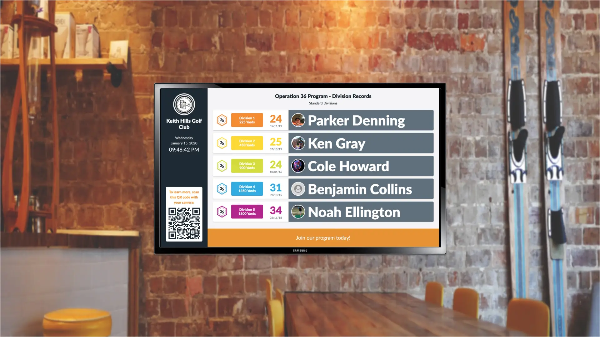
Academy Display
Marketed the Operation 36 program to prospective students at golf facilities by showcasing current student activity via a pro shop TV display.

Overview
Note: Some content has been redacted or omitted to comply with my NDA.
Flyers, posters, and emails are great for marketing the Operation 36 Golf (Op 36) program, but what if coaches had something more dynamic? What if they could use the TVs in their pro-shops like they do for other golf programs? What if they could automatically pull data directly from the Op 36 apps? That's what the Academy Display is for!
The Academy Display is a slideshow feature in the web app that displays live leaderboards and collages of students' photos for others to see. Coaches can also add custom graphics, such as advertisements and awards. To display the slideshow on a large screen, the coach can link their computer to the screen using a cable, directly access the web app on their TV (for smart TVs), or use a Chrome Stick, then start the slideshow. The display works on a variety of aspect ratios.
Not only does the Academy Display make new students interested in the Op 36 program, but it also benefits existing students by motivating them to play and train more so they can see themselves on the TV. By playing and training more, the students improve more quickly, thus increasing the value of the program.
Don't have time to read the process? Jump to Results for more final designs!
Process
Objectives

- Help coaches market their Op 36 programs in their pro-shop to prospective students.
- Increase the engagement of Op 36 students currently in those coaches’ programs by encouraging them to log more activities.
Research: Show student activity to both advertise programs and increase engagement

While they already have flyers, signs, and emails, our coaches also wanted to use the large TVs in their pro-shops to advertise their programs. We saw this idea as not only a great marketing tool but also an opportunity to increase student activity - a key indicator of an Op 36 program’s success.
From digging deeper, we learned that students loved trying to climb the leaderboard and posting photos of their golf activities. We also wanted to emphasize what makes Op 36 unique - the Op 36 Division Model - and allow coaches to add a few of their own custom ads or celebratory graphics.
Ideation: Screens to design for MVP

From our research, we decided to design a:
- Division Leaderboard to show off the record-holder for each division.
- Community Leaderboard to show off the top 10 most active golfers in the community.
- Photo Wall to show off the variety of student activities logged in the community.
- Custom Ad function where coaches could upload 1-3 graphics to display in the slideshow.
We also wanted to show off a community’s stats and add QR codes for easy class registration, but we had technical limitations at the time.
Prototyping: Adding custom call-to-action and QR code

I had our teammates - some of which had run Op 36 programs at golf facilities before - try out a prototype of the experience.
They didn’t have much feedback on the slide content, but they recommended shrinking the name of the golf club to gain more real estate. They also suggested providing a call-to-action message for the coach to include updates as well as a way for the students/families to easily learn more and express interest in the program. As a response, I added the permanent QR code and customizable call-to-action banner.
Development: 16:9 aspect ratio for MVP and responsive post-MVP

I created most of the configuration view and the different types of slides, while my teammate helped set up some of the configuration view, frontend slideshow logic (e.g. timed transitions), and the entire backend for the Academy Display.
Due to time constraints, I optimized the MVP for 1920 x 1080 (16:9) displays only, then added a caveat on the configuration screen. After the initial release, I refactored it to be responsive to other device sizes as requested by a few coaches.
Results: Excited coaches and students

Many coaches started using the Academy Display after the initial release. We continued to receive requests for enhancements every so often, and coaches have shared some examples of how they use the display (plus how their students get excited). That meant that they were actually using it and cared enough to want to improve it.


Reflection: Test extensively and save configuration settings
Based off of the few bug reports and UX issues we received, here are some ways that we could have improved our process and potentially avoided them.
- Test frequently, especially after making a major update. We added drag-and-drop functionality so the coach can easily change the order of their custom ads. However, we inadvertently introduced a new bug where if you deleted your custom ads in a certain way, it broke the custom ad feature. It took a while for us to find time to remove the bug, so we had to rely on Postman to fix it every time it broke for an individual coach.
- Do more research about the technology needed to use this feature. We didn’t think about how coaches might turn off the display at the end of each day. When they turn it back on the next day, they have to configure the display again (CTA message, duration, selected screens) and click the Start button again. All of this can be difficult if trying to do it on a TV display with a remote. We could have saved their settings in the backend so the display requires less setup the next time.