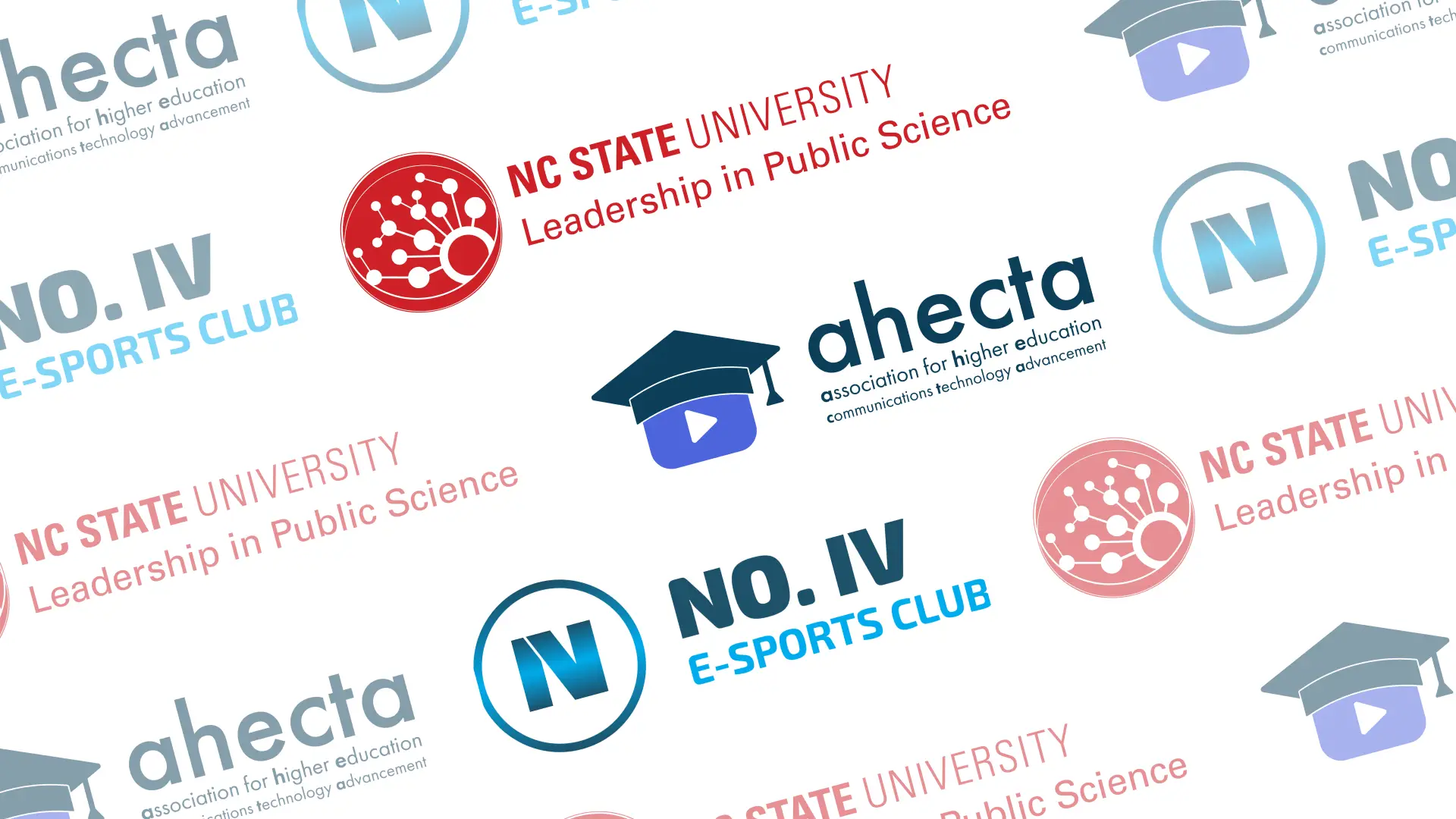
Assorted Logo Designs
Visualized identities of different organizations by designing logos and simple brand guides for them.
Overview
I worked with:
- NCSU's Leadership in Public Science (LiPS), a new faculty cluster at the university.
- The Association for Higher Education Communications Technology Advancement (AHECTA), an existing group of video professionals.
- No. IV E-sports Club, a new e-sports cafe in Raleigh, NC.
to do initial ideation, make revisions based on feedback, and export the final files in different formats.
Process
NCSU's Leadership in Public Science

Objectives
Design a logo for the Leadership in Public Science (LiPS), a new faculty cluster at NCSU. It needs to express the identity of the cluster without clashing with the NCSU brand. Ideally, it shouldn't use the typical science imagery, like an atom (none of the members at the time were physicists).
(This logo request began as a contest. LiPS would contact the winner of the contest and collaborate with them to refine the logo.)
Ideation

Since this was a contest, I wasn't able to consult the members of LiPS for more details. Therefore, I first started by researching LiPS on the NCSU website to form a clearer identity. I noticed themes of communication, connection, and interaction. After brainstorming scientific concepts with those themes, I came up with the idea of a Petri dish. It contained cultures shaped like continents with nodes connected by lines - all representing the network and spread of scientific knowledge across the world. The angles created by the lines also aligned with NCSU's angular brand imagery.
LiPS really liked the "culture" and "Petri dish" metaphors as well as the idea of connections and interactions. However, the focus on the Earth and overseas connections didn't quite resonate with them. They invited me to their next cluster meeting to get more feedback and context.

During the meeting, we discussed other imagery to replace the Atlantic Ocean (but still evoke a sense of "connection"), different versions of the logo that we'd need, and how to make the Petri dish concept more clear. With that, I removed the metaphors to the Earth, then explored more abstract representations with circles, hexagons, and even wolves (because they are social animals and the NCSU mascot).

The cluster thought that the wolves were interesting, but no one outside of NCSU would recognize them. As for the hexagons, the form was visually appealing, but the sense of "connection" wasn't as strong. Thus, we decided to work off of a combination of the circular and hexagonal concepts. LiPS suggested reducing the number of circles and connections to simplify the design, then adding more connections coming out of the largest circle (representing LiPS) to look more like "tendrils" spreading outwards. We also decided to try a version where the largest circle was at the bottom, and we liked that one the most.

The next order of business was to add the text and refine the edges so it looked more like a Petri dish. The NCSU brand at the time didn't have explicitly defined guidelines for clusters, so I tried finding examples of other NCSU logos online. While the cluster wanted to emphasize their own name, we noticed that most of the other logos made NCSU's name primary, so we kept that hierarchy in the end. As for the dish, I tried different stroke weights to form more continuous edges - some uniform, some tapered. I also created opaque and transparent versions.

LiPS preferred the opaque sides, even though Petri dishes are transparent. They then shared some tips for refining the edges. I used that feedback to create three final versions for them to vote on. After they unanimously voted on one version of the Petri dish, I created the variations (standalone, horizontal, and vertical) and exported them to the required formats.
Results
The final concept consisted of a Petri dish with circular nodes branching out like slime mold, conveying connection and communication.
Each variation of the logo was exported in black and red - NCSU's primary colors for logos - in CMYK and RGB modes, and in EPS, JPG, and PNG. The set also included an "illegal" horizontal variation, where the cluster's name was above NCSU's name since LiPS requested it.
AHECTA

Objectives
Design a more modern logo for the Association for Higher Education Communications Technology Advancement (AHECTA) that better represents their mission of promoting video use in education. Also create variations of that logo for use in different situations.
Ideation
AHECTA already had a logo concept in mind - a "play video" button with a graduation cap on top - that just needed refinement, but I wanted to explore other ideas as well. I first met with a member of AHECTA to learn more about the association, then did some research using their website. This helped me discover brand attributes to incorporate during ideation.

I then sketched rough concepts, experimenting with other imagery related to AHECTA and video, like loaders, nodes, and connections. I also played around with whitespace and text-only ideas, then presented all concepts to the team for feedback.


The team preferred their original idea. With that, I refined that logo, then brainstormed different horizontal, vertical (with the association's full name), and "university seal" variations. Because they didn't have a defined brand yet, I also provided them with different color schemes to try.
After reviewing these new ideas, the board of directors chose a few final logo concepts to use. I then prepared the individual files for each variation as well as some basic brand guidelines for AHECTA.
Results
The final logos consisted of:
- A purple and blue variation of the vertical logo without the full name (labeled "standalone").
- A horizontal variation with the full name spelled out (labeled "banner").
- Two university seals - one monochromatic with less detail and one colored with various strokes.
I also provided AHECTA with the brand colors and font weights to use. The color scheme gives off a professional and technical feel, while the Futura typeface looks more modern yet friendly - all attributes of AHECTA.
No. IV E-sports Club

Objectives
Design a logo for No. IV E-sports Club that conveys their focus on games and competition. It should feel "cool," modern, and tough.
Ideation
Like with AHECTA, the owner of No. IV already had a concept - an "I" and "V" combined to look like an "N" - that just needed to be iterated on. I used their brand attributes and existing game-related logos to guide my ideation.

First, I tried different heights and spacing for the "N" that I was given. Lowering its height and making it bulkier made it look stronger and more "competitive." Placing the "I" and "V" closer together made it look more like an "N". We also tried adding a slant to the N and rounding some of the corners to make it look more dynamic, but we decided it looked better when upright and angular.


From there, I started adding strokes, colors, and gradients - I had noticed that a lot of sports team logos used thick strokes for boldness. As for the gradients, I thought a metallic sheen would add "coolness," much like the GameCube and Xbox logos. Likewise, all of the colors were either metallic (silver and gold) or cool colors (blues and greens).
The owner of No. IV preferred the electric blues and the "N" inside of a simple circle. He picked several different fills to use for the final logos. Then I created horizontal and vertical variations along with some basic brand guidelines.
Results
In total, we ended up with 8 different fills for the standalone logo, resulting in 24 different logos total after creating the variations. The blocky Exo typeface adds to the strong, technological feel.